 Andrew Betts


Here’s a picture of sunset in my neighbourhood in east London:
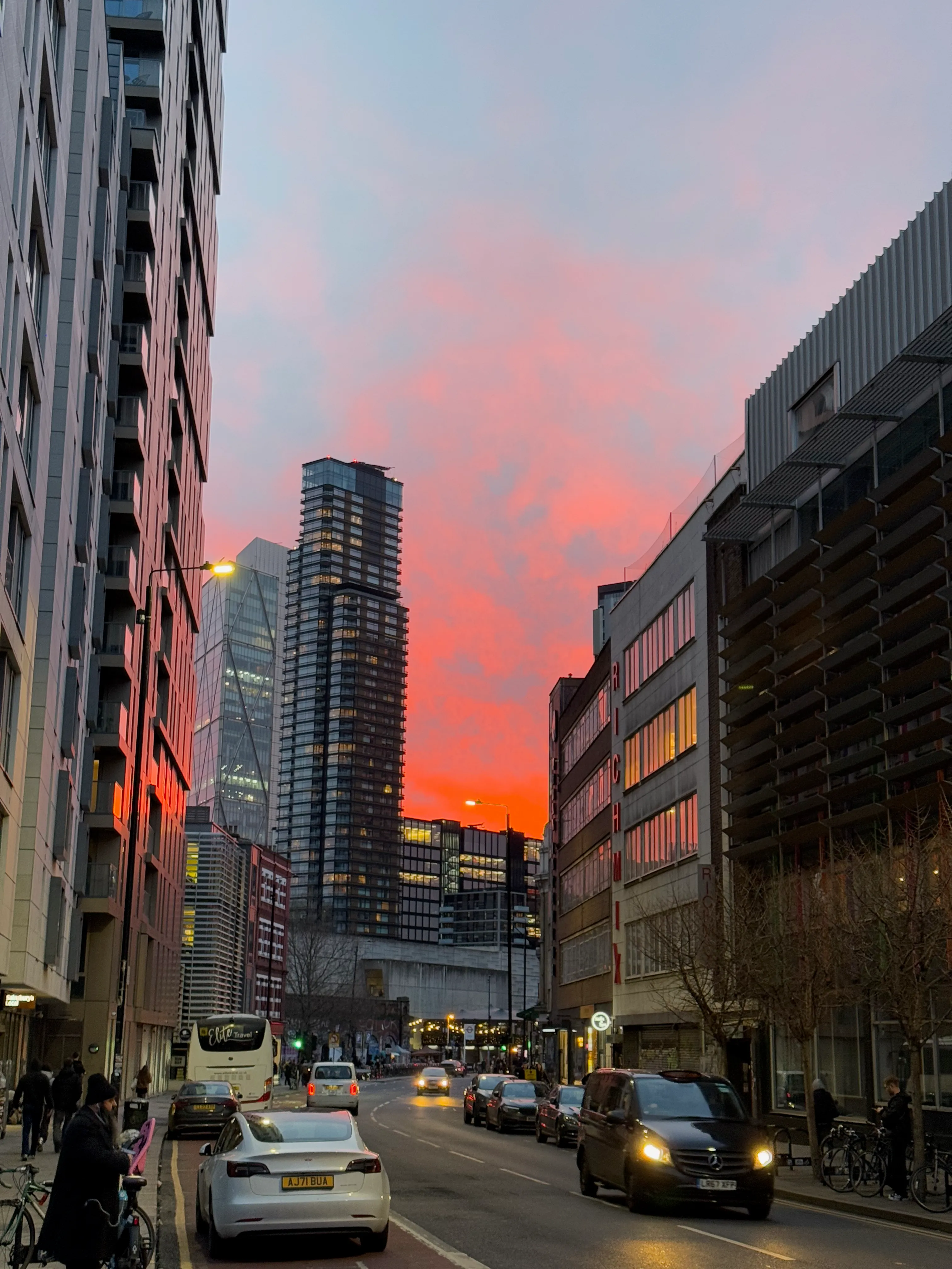
It’s pretty, but more importantly, it’s achieving a bunch of things that are often hard to get right with images on the web:
- Does not get stretched beyond it’s intrinsic width or height
- Maintains the correct aspect ratio
- Scales down to fit inside the width of the article container
- Scales down to ensure it’s not taller than the viewable area of the page (the viewport)
- Downloads a version that suits the size that it renders at
- Can be laid out at the right size before the image itself is loaded, avoiding layout shift
Feel free to play with the size of your browser window or load this page on a different device to see how the image behaves.
I recently rebuilt this website using Astro. As I drafted and redrafted a new blog post, the text kept… jumping:

I realised this was because the CSS was not reserving any space for the images, and when they loaded in, this would cause a layout shift.

I KNOW. I’M SO SORRY. As they say it’s possible my purpose in life is mearly to serve as a warning to others, so here’s how I got from layout shift criminal to perfect image poster child.
Inferred aspect ratio: the theory
Image layout used to be more of a problem that it is today. When the responsive design era arrived, setting fixed width and height attributes on an <img> element was no longer sufficient. We started overriding the HTML attributes with CSS properties such as:
max-width: 100%;
height: auto;
That worked, but the ‘auto’ height meant that the browser had to download the image to find out the aspect ratio before it was able to know how tall the image was. This results in the page being laid out with the image at the height specified in the HTML attribute and then ‘shifting’ so that the image had the correct height when the image data loaded.
That wasn’t good. Developers started omitting the width and height HTML attributes entirely, which meant the image rendered at zero height until it loaded. That wasn’t great either.
Workarounds like the padding hack emerged. If all your images had the same aspect ratio, you could make a container with 100% width, zero height, and a percentage padding-bottom. Vertical padding on block elemenets when expressed as a percentage is a percentage of the element’s own width, so can be used to create flexible-width, fixed-aspect containers.
This was solved properly with the introducion of the aspect-ratio CSS property, which as of now is widely available. But you still need to know what the aspect ratio of a particular image actually is.
Jen Simmons suggested that this ought to be solveable by using the dynamic values of the image’s HTML width and height attributes:
aspect-ratio: attr(width) / attr(height);At the time the attr() CSS function was not supported by any browser for use with arbtirary attributes, nor as an input to arbitrary CSS properties (it had only a very narrow supported use case for the content: property). It looks like this is starting to change - Google seems to have shipped support for attr() more generally in Chrome 130.
But, in the meantime, inferring the aspect ratio from the declared width and height attributes has landed in basically all browsers. You can override the width and height in CSS, and the browser still hangs on to an understanding of what the image’s aspect ratio is.
This works brilliantly but you’re still allowed to shoot yourself in the foot, which is exactly what I proceeded to do.
max-width AND max-height? Ambitious.
I wanted my images to be limited to the height of the viewport because it kinda sucks if you can’t see all of the image at the same time, and sometimes images can be quite tall, eg. screenshots from phones in portrait orientation. So my first attempt was this:
img {
    max-width: 100%;
    max-height: 100vh;
}
I reasoned that if the browser infers the aspect ratio from the HTML attributes, it can respect that, but constrain the final displayed size of the image to these max- limits on the width and height. What actually happened was that my images got stretched!
<div>
  <img src="https://picsum.photos/id/216/1000/1500" width="1000" height="1500" />
</div>
img {
  max-width: 100%;
  max-height: 100vh;
}
/* Some handy formatting styles */
div { max-width: 400px; border: 3px solid black; padding: 5px; margin: 0 auto; }
img { border: 1px dashed red;}
I think my expectations here were pretty reasonable actually, but that’s just not how it works. I’ve set max-width and max-height properties but I haven’t set width or height so they are taking their values from the HTML, which has them set to literal values, like “300”. So what happens is each dimension is set to a specific number and then capped at the maximum I set in the CSS, resulting in a stretched image
One deterministic dimension
So how do we make use of that inferred aspect ratio that is supposedly so useful? To fall back to aspect ratio, the browser needs to be told to calculate one dimension automatically. Let’s try that:
<div>
  <img src="https://picsum.photos/1000/1500" width="1000" height="1500" />
</div>
img {
  max-width: 100%;
  max-height: 100vh;
  height: auto;
}
/* Some handy formatting styles */
div { max-width: 400px; border: 3px solid black; padding: 5px; margin: 0 auto; }
img { border: 1px dashed red;}
Now the width is deterministic (specified on the HTML element, subject to the max-width: 100% in CSS), but the height is auto so can be calulated using the width and the aspect ratio.
This works in some situations but not if the max-height kicks in. That’s because the width is what we’re setting first, and then the height is calculated based on aspect ratio, but is then set to the lower of that number and “100vh”. So we end up with tall images getting squashed.
At this point I was an idiot and decided that adding width: auto was the solution:
<div>
  <img src="https://picsum.photos/1000/1500" width="1000" height="1500" />
</div>
img {
  max-width: 100%;
  max-height: 100vh;
  height: auto;
  width: auto;
}
/* Some handy formatting styles */
div { max-width: 400px; border: 3px solid black; padding: 5px; margin: 0 auto; }
img { border: 1px dashed red;}
OK now we have no deterministic dimensions, so whichever dimension you try and calculate first, you can’t use aspect ratio because you don’t yet know the other dimension. Both dimensions are therefore start at zero. But when the image loads, it magically aquires exactly the dimensions we want. So it ultimately lays out correctly but there’s a layout shift.

I’m frustrated by this - I mean the only extra information the browser gets by actually loading the image is the intrinsic size, and I’m telling you what that is via the width and height attributes! So why can’t we figure out ahead of time how to draw the largest possible box of one aspect ratio inside a box of another aspect ratio? Argh!
The bottom line is, given the way CSS works, the browser seems to need one dimension to be resolvable to a fixed number to allow it to calculate the other based on an aspect ratio. Setting both dimensions means the aspect ratio is ignored. Setting neither means you have nothing to go on and the image will be zero-size.
So we’re back to max-width: 100%; height: auto, which doesn’t let us constrain the height. Argh!
Object-fit to the rescue
Let’s go back to setting a max-height. The problem we then had was that the resulting image container was no longer guaranteed to be the correct aspect ratio. However, we can change the way images are fitted into the space occupied by the <img> element, using the object-fit CSS property. You might know the background-size property, with values like “cover” and “contain”. The same principle can be applied to image elements because they are so-called “replaced” elements.
Wait, what? So the size of the image is not the … size of the <img>? I know. Wild.
<div>
  <img src="https://picsum.photos/1000/1500" width="1000" height="1500" />
</div>
img {
  max-width: 100%;
  max-height: 100vh;
  height: auto;
  object-fit: contain;
}
/* Some handy formatting styles */
div { max-width: 400px; border: 3px solid black; padding: 5px; margin: 0 auto; }
img { border: 1px dashed red;}
Magic! When max-height kicks in, the image now has some ‘unused’ areas to the left and right (in the demo above you should see these as blank white areas inside the <img> element’s dashed red border)
A bit… off center?
There’s a bit of untidyness here because if the image is narrower than the article container but is very tall, then the <img> element will end up left aligned by default, but the actual image will end up centered within the <img> frame. Let’s keep the same rules but adjust a few numbers to make that more obvious:
<div>
  <img src="https://picsum.photos/250/600" width="250" height="600" />
</div>
img {
  max-width: 100%;
  max-height: 100vh;
  height: auto;
  object-fit: contain;
}
/* Some handy formatting styles */
div { border: 3px solid black; padding: 5px; margin: 0 auto; }
img { border: 1px dashed red;}
This is because the object-position default is “center” whereas the text-align property which determines the alignment of inline-block elements such as <img> defaults to “left”. So we get an image that is a bit off center.
We can fix that with an explicit object-position:
<div>
  <img src="https://picsum.photos/250/600" width="250" height="600" />
</div>
img {
  max-width: 100%;
  max-height: 100vh;
  height: auto;
  object-fit: contain;
  object-position: left;
}
/* Some handy formatting styles */
div { border: 3px solid black; padding: 5px; margin: 0 auto; }
img { border: 1px dashed red;}
But what if you actually want non-full-width images to be centered? You’d generally need to adjust the text-align of the image’s parent element, and that’s only if the image is being treated as a default inline-block. These days it’s as likely to be a flex item or a block.
A shadowy <Figure> arrives on the scene
With all this thinking about big images, it’s easy to forget that blog posts might need to include small images too, and those might be better rendered inline with text, or placed adjacent to one another, like this:

So I figured I needed two layout modes for images: those intended to be laid out as block elements can be wrapped in <figure> - which also provides the opportunity to give them a caption via <figcaption>. We can attach CSS to the figure element that centers the image element, and object-position on figure > img centers the actual image within the image element:
figure {
    ...
}
figure > img {
    max-width: 100%;
    height: auto;
    max-height: 100vh;
    object-fit: contain;
    object-position: center;
}
Images not inside of <figure> wrappers will remain left-aligned, and any empty space in the <img>
Markdown to markup
I write my blog posts in markdown. So I need to be able to generate these different kinds of layout, ideally without having to write HTML inside of Markdown. Images that appear in the flow of text or on a line with other images should be inline-block elements:
  Astro will turn that markdown into the HTML we want by default, so no extra work needed there. But where an image is the only thing in a paragraph, I want it to be wrapped in a <figure> and become a block element:
Sometimes, figures will have captions, so it would also be good to be able to write this kind of thing:
:::figure

Sunset in Brick Lane
:::That triple-colon is a markdown “container directive”, for which there exists a Remark parser, so a good choice of syntax. Often it’s pretty reasonable to use the same text as the ALT text and also as the image’s visible caption, so to allow for such cases and because I hate repeating myself, I also want to support this:
OK, so to make all this markdown turn into the right HTML, I wrote a Remark plugin:
import { visit } from "unist-util-visit";
import type { RemarkPlugin } from "@astrojs/markdown-remark";
import type { ContainerDirective } from "mdast-util-directive";
import type { Node, Image, Paragraph } from "mdast";

type Figure = {
  name: 'figure',
  type: 'containerDirective',
  data: { hName: 'figure' },
  children: [ Image, Paragraph? ]
}

const CAPTION_PREFIX = 'Caption: ';

export const remarkFigureFromContainerDirective: RemarkPlugin = () => {

  return (tree) => {
    visit(tree, "containerDirective", (node: ContainerDirective | Figure) => {
      if (node.name !== "figure") return;
      if (node.children.length === 0 || node.children[0].type !== 'paragraph') return;

      // Unwrap a nested paragraph element
      const paraNode = node.children[0];
      const childList = paraNode.children;

      // Rewrite the children of the figure to have exactly two - the image and the caption
      const imageNode = childList.find(n => n.type === 'image');
      if (imageNode) {
        node.data = { hName: 'figure', hProperties: { className: 'with-caption' } };
        node.children = [imageNode, {
          type: 'paragraph',
          data: { hName: 'figcaption' },
          children: childList.filter(n => n.type !== 'image')
        }];
      }
    });
  };
};

export const remarkFigureFromParagraph: RemarkPlugin = () => {

  return (tree) => {
    visit(tree, "paragraph", (node: Paragraph | Figure, _idx, parent: Node) => {
      if (parent.type !== 'root' || node.children.length !== 1 || node.children[0].type !== 'image') return;
      const imageNode = node.children[0];
      const caption = imageNode.alt.startsWith(CAPTION_PREFIX) ? imageNode.alt.replace(CAPTION_PREFIX, '') : null;
      node.data = { hName: 'figure', hProperties: { className: caption ? "with-caption" : "" } };
      node.children = [imageNode];
      if (caption) {
        node.children[1] = {
          type: 'paragraph',
          data: { hName: 'figcaption' },
          children: [ { type: 'text', value: caption } ]
        };
      }
    });
  };
};
In my case I’m using Astro, so I import these into my Astro config:
import remarkDirective from 'remark-directive';
import { remarkFigureFromContainerDirective, remarkFigureFromParagraph } from './src/plugins/remark-figure';

export default defineConfig({
  markdown: {
    remarkPlugins: [
      remarkDirective,
      remarkFigureFromContainerDirective,
      remarkFigureFromParagraph,
    ],
    ...
  },
  ...
});
Now when Astro builds my pages, they will have the image markup I need to apply the correct CSS.
Responsive sources
If you’re viewing the article on a device with a small screen, and the image is therefore displayed at a small size, we don’t want that device to have to download a huge image file and then throw away most of the pixels. Fortunately, Astro has a solution for this built in, with (at time of writing) experimental support for responsive images, which can be enabled in Astro config:
{
  experimental: {
    responsiveImages: true,
  },
  image: {
    experimentalLayout: 'responsive',
  },
  ...
}
Doing this prompts Astro to generate multiple variants of the image in an appropriate range of resolutions, and then write out the <img> tag to include srcset and sizes attributes, like this:
<img src="/_image?href=%2FIMG_8760.png..."
     srcset="/_image?href=%2FIMG_8760.png... 640w, /_image?href=%2FIMG_8760.png... 750w, /_image?href=%2FIMG_8760.png... 828w, /_image?href=%2FIMG_8760.png... 1080w, /_image?href=%2FIMG_8760.png... 1280w, /_image?href=%2FIMG_8760.png... 1668w, /_image?href=%2FIMG_8760.png... 2048w, /_image?href=%2FIMG_8760.png... 2560w, /_image?href=%2FIMG_8760.png... 3024w"
     sizes="(min-width: 3024px) 3024px, 100vw"
     width="3024" height="4032"
     style="--w: 3024; --h: 4032; --fit: cover; --pos: center;"
     ...
/>
The browser will then download the source image that best matches the size of the space that it’s going to be rendered into.
OK, so this works well, but I have two problems with it:
- If I capture screenshots on a ‘high DPI’ screen like my Macbook, which has two physical pixels per CSS pixel, and then display it on an Astro article, it is displayed at twice it’s intended size (only a problem for small screenshots, but still, annoying)
- If you “Save as” an image that’s been rendered at a small size, the browser will save the version that was displayed, not the highest resolution version that’s available. It might also save an AVIF or WEBP version when for compatibility you might really want to save the PNG or JPEG.
I’d like to find solutions to these problems as well, but I have to stop sometime and it’s about time I published this. With any luck I’ll improve on this later and post a followup!